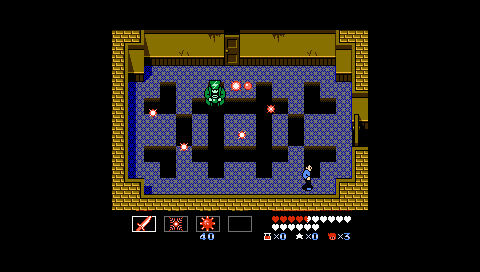
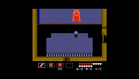
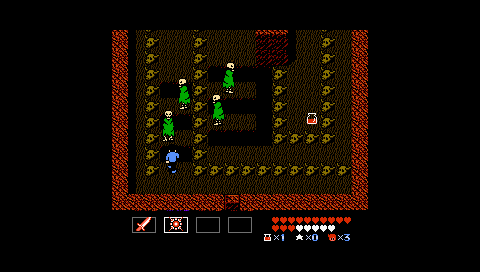
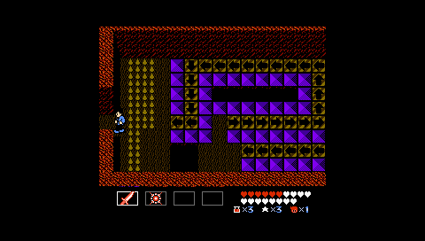
What is The Commune?
We're a group of gamers, and we're always looking for new gamers to join us. Every month or so, we pick a game to play. We chat about the game together, and we record podcasts, record videos, and write essays. You can reach The Commune in the following ways:
- Register on the forums. This is where we organize events and pick games.
- Reach us by email at vgcommune *A*T* gmail *D*O*T* com.
(Close)
StarTropics II Photo Diary
Written by
Daniel Primed
About the game
StarTropics
Posted on
Sep 3, 2016
Chapter One
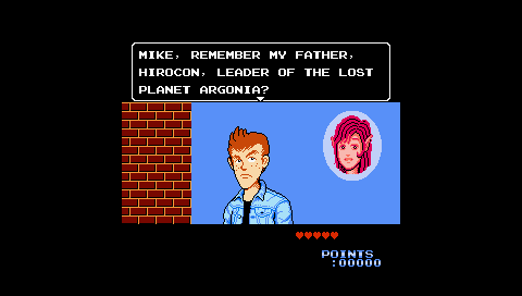
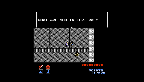
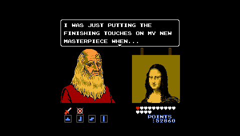
Nothing says "Welcome to the sequel" like a long unnecessary cutscene which builds a fresh premise out of incidental oddities featured in the first installment's ending. In this case, the people of Planet Argonia you saved on your way to defeating Zoda.
General Comments
-The entirety of the first chapter is cutscene. Already a consistent chapter structure is broken.
Chapter Two
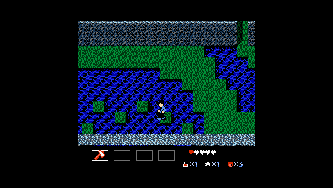
Optional diagonal jumping is introduced.
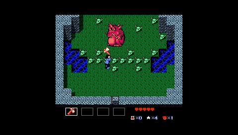
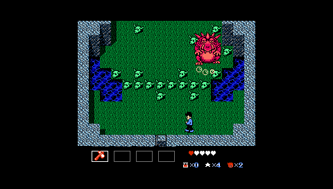
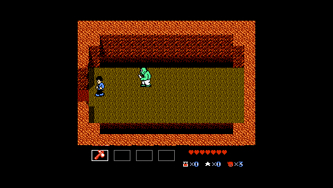
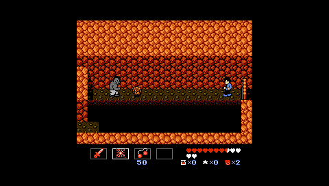
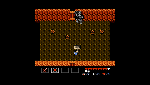
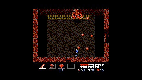
I like how if you attack this boss's minion swine (covered by the tomahawk in the first screenshot), the boss will enter an aggressive state and will move faster and throw out more projectiles than normal.
General Comments
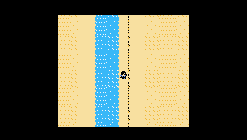
-Random mini-dungeons which the player enters when exploring certain segments of the overworld (think random battles) punctuate the opening moments of gameplay. It's weird how you're dropped in amongst enemies without a means of attack.
-Verticality and diagonal jumps and attacks are the new hotness in the level design. We see it slowly teased out throughout the initial chapters.
Chapter Three
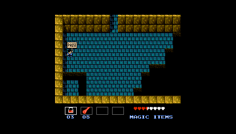
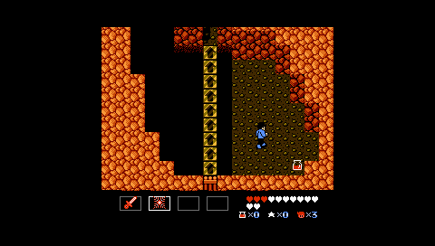
Dead ends where you can't tell whether or not the screen is scrolling seems to be another new thing. I'm not a fan.
This enemy is identical to the bears in Chapter Two.
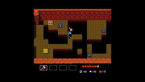
Attacking diagonally to clear enemies which block access to platforms is another new trend in the gameplay challenges. It's awkward getting Mike to face diagonally. Will need to investigate this further.
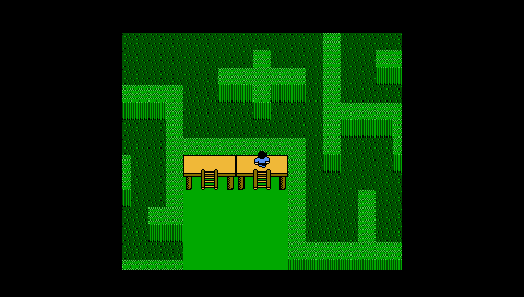
Once you move off this platform, the layout is replaced by a covered canopy. Half the time you can't see far enough ahead to use this information decisively. Kind of ruins what would otherwise be a decent short-term memory test.
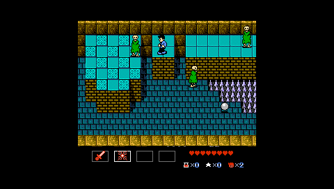
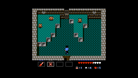
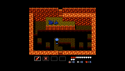
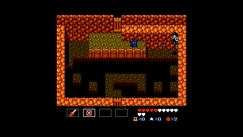
The enemies crowding a platform idea is expanded here with verticality. I also like how they use verticality and locks and keys (a switch exists to the left) to move the player around the room. The raised platform is two tiles high so that Mike can't reach them or attack the enemies from the lower levels. This creates a clear distinction of floors.
The detailed sprites could fool you into thinking this was a Genesis game.
You can collect up to three potions in this dungeon. This is helpful given the dungeon's extended length and the boss's powerful laser attack.
We see diagonal attacks explored here once again. (It truly is the tile-jump of StarTropics II). If Mike is in direct alignment with the boss, he's potentially vulnerable to his front-on laser beam. So its best to hang to the sides and attack diagonally.
General Comments
-A consequence of the variable movement is that Mike's body can be aligned with an enemy, but his attacks won't. It is really fiddly having to align Mike up just right. The same applies to jumping.
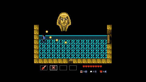
-There are three dungeons in Chapter 3. The third (the pyramid) moves on from the simple enemies-in-a-single-screen-room challenges to include fade-in platforms, switches, puzzle elements (snake charming), conveyor belts, and invisible pits.
Chapter Four
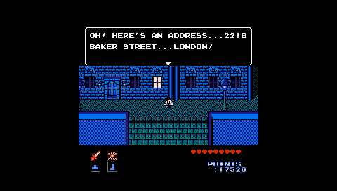
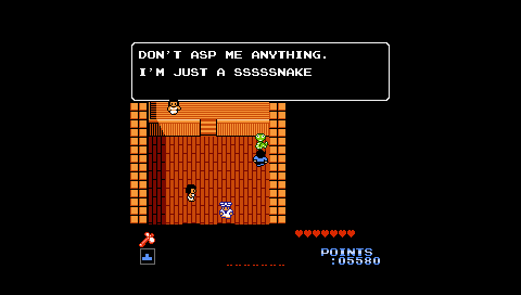
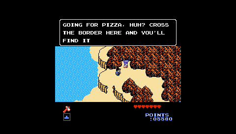
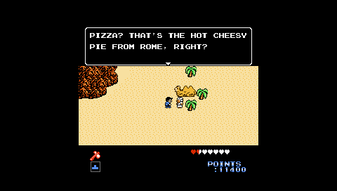
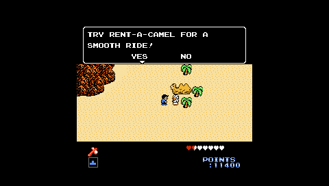
Cool setting. The sprites are really lush and the NPC dialogue fits the era. This is pretty impressive for a NES game.
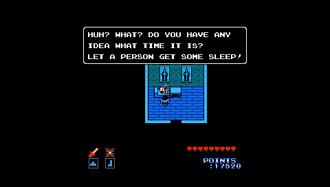
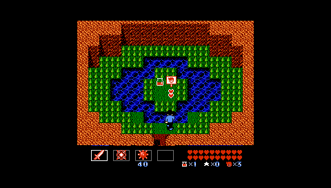
A neat subversion of the tendency for players to poke around strangers' homes. Why doesn't he just lock his door?
The blob enemies bounce around the room. They're able to jump over your projectiles--and so starts a new theme in the enemy variation.
Mike is just able to make this 2-tile jump from the raised platform.
The enemy variation trend continues. These owls are able to attack and hit the player even though they fly in the air and projectiles fired from the ground pass underneath them. You must therefore jump and attack them at the same time.
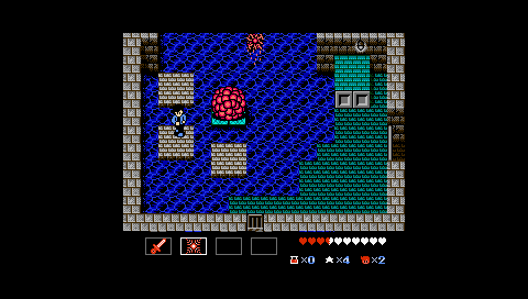
The grey platforms gradually fade out. Their positioning around the brain boss force the player to make diagonal jumps--something which at this point is now a staple of the dungeon design. Verticality and diagonal movement are two major trends in StarTropics II's dungeons. So far there are no new or functionally unique inventory items.
You can leave and re-enter this dungeon to mine the free supply of hearts in this first room.
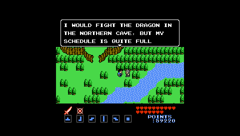
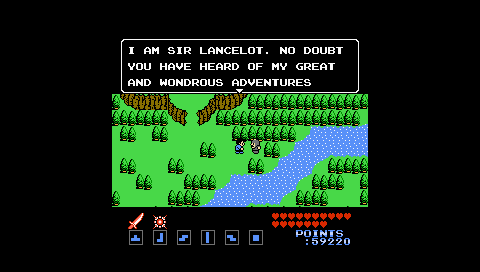
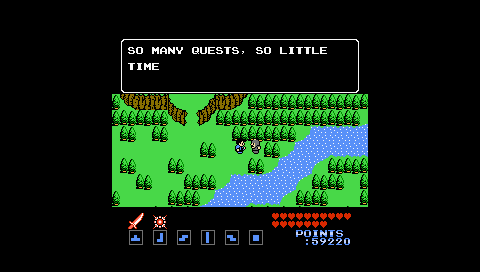
Funny NPC Speech
And people praise Metal Gear Solid for breaking the fourth wall.
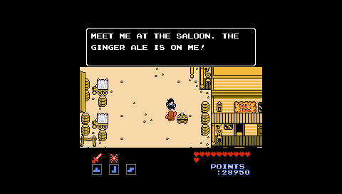
They're really playing up this American pop culture thing.
Chapter Five
This boss uses the boulder as a sort of shield and so this enemy is similar to the knights (Darknuts) in Zelda II, except that the boss slowly inches closer to Mike after rolling each boulder. So the longer you take to beat him, the less time you have to react to his boulder throws.
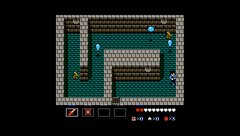
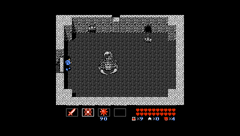
Another challenge focused on the projectiles fired from a higher place. The scorpions fire beams from the raised platform which can hit Mike ('s head?). The perspective makes it hard to read whether or not such projectiles will hit Mike, although it does make sense according to the game's tile logic (i.e. Mike is 2 tiles tall). Subsequent challenges make it clear that enemies two tiles high are unable to attack Mike, but he will get hit if standing on a tile-high platform. I'm not sure whether this chunk of design space is really worth mining given how unintuitive it is.
The new weapon has a longer attack range and the far-right corner allows the player to attack and keep out of range of the scorpions' projectiles.
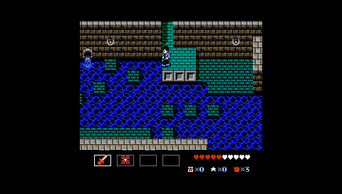
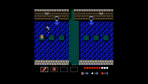
Conveyor belts are a new dungeon gimmick which is explored over the course of the next few chapters.
The new weapon upgrade that they force on you pre-dungeon make this boss (and many of the enemies in the dungeon) pretty easy.
General Comments
-The time travel theme gives the game some great aesthetic variety. However, the experience just mushes together in my head. I think it's because there are fewer narrative arcs to give Mike's actions purpose. In StarTropics I you had a clear sense of direction. Even when you weren't looking for Dr. Jones, the game would task you with solving the plight of whichever island nation you landed upon. In StarTropics II you warp into a time period, talk to the NPCs in the nearest town who point you in the direction of the dungeon, beat the dungeon, and then warp onto the next time period. In most cases, your presence in each time period is incidental to the period itself. Instead of Mike being caught up in the world of the NPCs, they get caught up in his pursuit of the Tetrads.
Funny NPC Speech
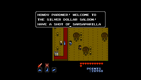
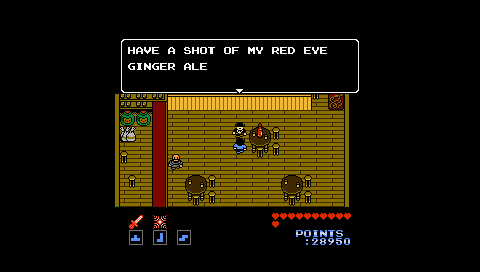
Loving the non-alcoholic alcohol references.
Chapter Six
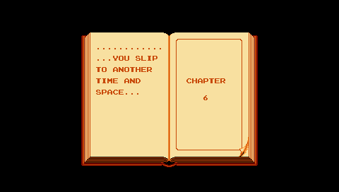
The title cards for each chapter are mostly the same, which feeds into the issue of context and purpose mentioned earlier.
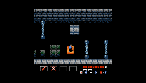
This mini-dungeon features a series of timed jump and diagonal jumps with health refills which the player can grab to scale the difficult. I wish diagonal jumping had been originally introduced as clearly as it is covered here.
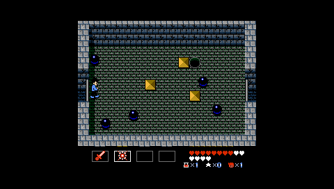
An interesting variation on the floating balls in StarTropics I. The balls move horizontally or vertically in straight lines. You need to attack them to have them switch their axis. The only problem is that when the balls switch axis, they sometimes move towards the player and can easily hit Mike. I wasn't able to figure out their pattern.
General Comments
-One of the dungeons has you switching back and forth between overworld and random dungeon chunks. The overworld segments aren't terrible interesting, so they probably shouldn't have mixed the two gameplay types.
Chapter Seven
This room is quite tough. The maiden continuously drops bombs which explode and send projectiles in eight direction. If you get in close, then you have limited reaction time to the bombs. You have to predict when and how they'll explode, where the maiden is moving, and how to line up a shot as well as navigating the inconsistent tiling. I reckon this challenge is too complex for a player to cleanly complete, unless they get lucky and catch the maiden in an easy-to-attack position.
You really need to clear the bats as soon as possible, otherwise they clutter your movement options when Dracula blows you backwards and sends a spread of projectiles your way. I like how this boss is best defeated with diagonal aiming where you can catch them at the right angle. I feel like this boss makes use of ST II's new controls mores than most of the other boss battles.
General Comments
-There really is no context to this chapter aside from Zoda saying that he'll send you to see Dracula. You follow a mountain trail leading up the manor and then beat the dungeon.
Chapter Eight
This is a neat idea, you need to attack the skeletons to have them fall down (think Dry Bones). The layout forces you to attack the skeleton farthest away from you first, which means timing the attack around the movement of the closest skeleton. Their short down time also comes into play too as you'll want them both to be down when you cross.
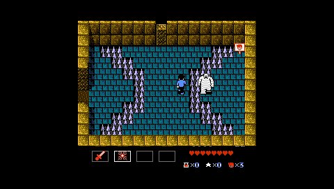
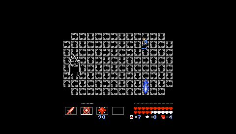
Conveyor belts are used in conjunction with spiked paths. The conveyor sends you up to a three way split in the belt. Two of the paths have a protruding spike, so you'll have to choose the free layer. At the far side of the room, spikes are spawning near the door, so the player has a limited time to reach the end before the exit is filled in with spikes. The timer doesn't really gel with the conveyor belt, though. It takes time to backtrack on the conveyor if you don't read the routes in time (which is likely given the speed of the conveyor). You can't really afford to backtrack given the spike timer at the exit. So you pretty much have to do a trial run and then memorise the layout.
This boss uses a series of conveyors on the outer edge to simulate jousting. This is a neat idea. The trick is to stand still and synchronise yourself so as to be a few tiles ahead of the knight. Then you can fire ahead of the knight so that he will move into your shots. The challenge draws your attention towards a nuance which otherwise wouldn't have been apparent.
If you are in vertical or horizontal alignment with this enemy, they'll fire a beam your way. This challenge requires the player take advantage of the space around the sides of the bridge or the corners on the right-hand side of the bridge. You need to stake out those positions and then attack the enemy diagonally depending on their movement. Higher order play hinges on taking advantage of Mike's freer movement and attacks.
The yellow platform is just small enough to make Mike's variable (non-tile-based) movement a hassle. I found that it was easy to jump just short. When the platforming demands more precision, you wish you had the reliability and cleanness of StarTropic I's controls.
This freer movement also becomes apparent in this tight challenge. It's all too easy to stop not quite in between the spaces before each horizontal lane.
You need to jump and attack to hurt the dragon. Fortunately the dragon doesn't move into the bottom-most row of tiles. If he could, then I think this challenge would be too overwhelming for the player. There's not much reaction time given when the dragon lowers its head to breathe out flames.
General Comments
-Falling between floors is a trend in this chapter. It's not very intuitive in some rooms how you'll fall through the floor as soon as you defeat the last enemy.
Chapter Nine
You can jump from the space on the side into the centre area (i.e. one tile diagonally).
The small scorpions which enter in through the two holes in the wall are really annoying. This is one of those bosses which feels cluttered and overwhelming as the space you have to work in is small and busy.
The conveyor belts won't send you off the side of the platform. They will sometimes push you towards a corner in which Zoda spawns into it, which is problematic. I'm not really a fan of this boss battle either as its not possible to read and respond to the pull of the conveyors and so you have to manage being pushed around in random directions, which isn't much fun.
General Comments
-I still have no idea what the stars do.
-Overall, StarTropics II is much easier than the original game. Many rooms have secret switches which reveal hearts and potions. I don't think that the four-heart refills were in the original game. You also get more hearts earlier in the game as well.
-The other thing about the game's difficulty is that Mike is much more powerful than the enemies in StarTropics II. He is able to move and shoot diagonally, whereas the enemies move and shoot either vertically or horizontally. Mike's movements may have been stricter in StarTropics I, but the enemies were designed to counter and respond to his movement in unique and interesting ways. Many of that game's challenges were designed around the dynamics and nuances of the relationship between Mike, the enemies, and the space of the environment. StarTropics II Mike is easily able to move past enemies or shoot them diagonally in ways that they can't respond to. Sometimes unique gameplay challenges are constructed out of this dynamic, but for most of the game your tackling StarTropics-1-esque enemies with StarTropics II mechanics. His weapons and health are regularly and automatically upgraded, so the game doesn't have the same squeeze that the original title has. You were forced to learn the behaviors of enemies in ST1, but in ST2 you can just stand at the other side of the room and fire your overpowered magic projectiles. Sometimes the game tries to up the challenge by adding more enemies or sticking you on a conveyor belt, but these approaches tend to clutter the gameplay and overwhelm the player.
-The game's perspective and the lack of graphical fidelity make it difficult to read depth, which is why the challenges which use height-based attacks fall flat. You can't engage with something you can't comprehend very well.
Funny NPC Speech

